About


Wednesday, October 24, 2012

Hunter Douglas Fall Promotion!


Bad blinds got you bummed?

Whether you’re looking to let light in or block it out, Hunter Douglas has blinds for you. With a multitude of options, the team at JMD can guide you through the process and find the very best window treatment solution for you and your home.

We are so enamored with Hunter Douglas that we want to offer anyone thinking of window treatments a fabulous deal! If you order Hunter Douglas blinds through Jenny Martin Design from now until December 31, 2012, we will give you one free blind for every three purchased!


Email us at info@jennymartindesign or give us a call at (250) 383-8206 to set up a consultation today!

Friday, August 24, 2012

The Ocean 98.5 FM's Ugliest Bathroom

  Of all the bathroom's submitted into The Ocean 98.5 FM's Ugly Bathroom Contest, it was finally decided and here it is!  One of the ugliest bathroom on Vancouver Island will be getting a spectacular makeover worth over $18,000!  All thanks to the generous contributions by The Ocean 98.5 fm, Goodison Construction, Illuminations Lighting Solutions, Jason Good Custom Cabinets, Stoneage Marble & Granite, Jenny Martin Design, & Victoria Specialty Hardware.

   The light fixtures, unfortunately are not efficient.  There is a single light tucked in the far corner of the room and a track light above the vanity, which is not ideal for shaving or putting on makeup.  There is good natural light coming into the space with 3 completely different sized windows, all of different ages and conditions: 1 really old and tiny, 1 medium sized sort of older glass block window that is becoming very mouldy, and 1 large operable window in good condition.


  The tile in the tub shower have seen better days and will get a complete overhaul including new floor tiles, new accent tiles and addressing any issues with mould.


 All the millwork will be replaced and kept consistent in terms of style and material.  According to the lovely owners, Abbie and Dave, storage is a major issue while trying to keep it out of hands reach from their little crawling toddler.  The vanity will also have a new stone countertop.

 Plumbing fixtures need a major upgrade.  No more shell toilet lid!!!!


   Be sure to check in as we progress in this dramatic transformation!  We are very very excited to share our concept and finish schemes in the next few days!


Monday, July 16, 2012

CHBA CARE AWARD FINALISTS ANNOUNCED!

  This morning the finalists for the 2012 Care Awards were announced by the Canadian Home Builders Association.  We are very excited to be nominated in 7 categories!!!!
JENNY MARTIN DESIGN nominated for:
Best Residential Renovations or Restoration $125K-$300K - "Amphora"
Best Kitchen 200-250 sf - "Amphora"
Best Multi-Family/Townhouse Project - "Brownstone"
Best Interior - Residential under 2,000 sf - "Brownstone" & "Amphora"
Best Interior - Commercial over 3,000 sf - "Romeos"
Best Website - Company


"AMPHORA"
"Consumers and contractors alike will enjoy these finely crafted homes, with attention paid to energy efficiency and natural materials...The finalists continue the CARE Awards tradition of raising the bar for homebuyers and the industry." 
- Lee MacFarlane, CARE Awards Chair

Gold winners will be announced at the CARE Awards gala on Friday, September 14th at the Fairmont Empress Hotel.

During the month of August and September, the public will be asked to select the winner of the annual People's Choice Award from among the finalists.  Be sure to check them out at www.careawards.com and at advertised locations.  We will keep you posted on those!

You can check out the nominated projects on our newly vamped website!  (Also nominated for an award!)

Congratulations to Maximilian Huxley Construction Ltd., Abstract Developments, Jason Good Custom Cabinets, and The Sky Is The Limit!


Thursday, June 28, 2012

New JMD Website

Hey everyone!

My name is Esrah, and I've been working here at JMD since late April. Some of you may know me as the deep voice who answers the phone occasionally. I'm a first year (going on second year) in the Applied Communication Program at Camosun College. The program teaches students about many aspects of media including print, design, video, radio, etcetera. As part of the curriculum, we work 300 hours over the summer in a co-op placement.

When I came across Jenny's posting, I thought, "how cool would it be to design a website for a design firm!" Having a background in photography and little experience in web design, I was nervous about applying since the only website I'd made prior to working here was my own (and it was lacking to say the least). However, being the kind people they are, the entire crew here made me feel right at home, and I began working on the new design for their site. Jenny and the rest of the team made it clear they wanted something simple and clean, but with some flare. Essentially, a canvas to showcase their work, rather than overpower it.

After several revisions, I started building the site, using plugins and code I'd never even heard of before. I felt swamped immediately, trying to wrap my head around all this new information, but I plugged through, and now, a couple months later, the new site is up and running! 


Having the opportunity to work closely with everyone here was invaluable. I didn't have to waste time wondering about design revisions, I could just ask. In addition, it gave me a different sense of the team dynamics, which meant a much better website in the end.

Although I'm no expert, working here has given me a tremendous amount of confidence in web design. For the rest of the summer, I'll be building a couple websites and taking pictures before I return to school in the fall.

For inquiries about the website, or my photography you can reach me at esrah.boulton@gmail.com and my work can be seen at www.esrahboulton.tumblr.com

For anyone who didn't see the original site, I've included some before and after pictures below.

Before - Home page.

After - Home page.

Before - Portfolio page.

After - Portfolio page.

Before - Services page.

After - Services page.


Monday, May 14, 2012

JMD Fav's: Chandeliers

  In the world of interior design, there are hundreds of thousands of options and styles in every category.  Lighting is a major category that includes wall sconces, ceiling fixtures, table lamps, floor lamps, pendants,  chandeliers and more!

When it comes to lighting, particularly CHANDELIERS, it is one of the most crucial elements  in a space to reflect the "mood" of the space.  It is important to select a fixture that coincides with the overall essence of the space.  In many spaces, the chandelier is the key feature of a space.

Image from Hinkley Lighting - Valley 4705BN

  Typically, a chandelier will be found centred in the middle of the dining room.


Image from Design Sponge


 If your home is more grande, then you can have an extravagent chandelier in the entryway.

Image from Pinterest

We always love to include a chandelier in the ensuite bathroom or a girl's bedroom.

Image from Ideas Casas
Not:Love the different size mirrors on the wall!


Chandeliers - It is one of the hardest items to narrow down since there are so many beautiful pieces that come in an array of sizes, styles and finishes.

We have selected some of our favourite fixtures to share with you!

Jenny's Fav Chandelier:


BOCCI 14. MY FAVORITE! They remind me of vintage Japanese fishing floats with a story from the sea... Adding a playful yet mysterious element to modern interiors with their soft candlelight glow.. They more that are grouped together the more incredible the effect! AND they're not designed in Italy.. They are the brain child of local Vancouver architect Omar Arbel who I had the pleasure of meeting here in Victoria last year.    
            
 -Jenny             


Jess's Fav Chandelier:


The Tusk Chandelier by Hudson Furniture Inc. has been on my mind lately... I can see it making an incredible statement in a West Coast Contemporary space paired with a neutral backdrop of cool greys and rich walnut tones. Although slightly Gothic in style, the lines of this piece remind me of antlers, a popular silhouette currently found in both traditional and modern settings. The chrome finish reflects the light beautifully, drawing your eye directly to this stunning fixture. Would love to have this hanging in my dining room!
 -Jess   
                

Mari's Fav Chandelier:


I'm in love with the Valentina Chandelier by Murray Feiss.  Found in an oxidized bronze finish, this fixture comes with the option of 4, 6 or 12 light.  It has a very classic look while incorporating soft curves and clean contemporary lines. I would love to see this in my imaginary dream home entryway with large scale Cararra gold marble tiles and large windows to let the crystals glitter and gleam!  

-Mari

Annie's Fav Chandelier:


My favourite chandelier is a large pendant light from Tech Lighting called the Madrid Pendant. The handmade knit wool cover creates a soft textural element to the light. It's a fun and funky light that would work in a variety of spaces. I'd love to see it over an eating nook in a contemporary industrial home.
-Annie   
To find out more information on lighting, be sure to ask any one of the helpful representatives at Illuminations Lighting Solutions.

Tuesday, May 8, 2012

Beautiful Home of Dawna Jones FOR SALE

Dawna Jones is a Vancouver based Interior Design Consultant who has been in the spot light of Houzz.com, Sunshine Coast Life Magazine and  House & Home Magazine.


With 16 years of experience in the design field, her tasteful colour choices, attention to detail and refined finishes create a welcoming space with a contemporary approach.

After completing the design of her 4th house, she has put her current home up for sale!!! Check out a few images of it here!  It looks amazing!


(Photos from Houzz.com)

  We love the use of bold colours and patterns throughout the space while maintaining a nice balance of white and natural materials.  


You can find out more about Dawna Jones and her business here.

For more information on the House for Sale be sure to visit her site at 754winnroad.com.


Tuesday, May 1, 2012

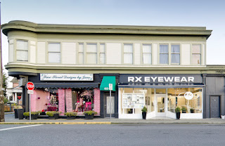
RX EYEWEAR


   In many instances, renovations occur due to an unfortunate circumstance that is out of an owners control.  From leaky foundations to floods and fires, they can all disrupt any business or resident by putting many in a stressful and costly situation.

  For Brian Cloosterman of RX Eyewear, what was supposed to be an improvement to the building roof turned into a devastating fire that ultimately affected his shop with a massive flood.  

 Brian started in the optical industry immediately out of high school and opened his own business 15 years ago.  2 years after starting his eyewear shop, he relocated to James Bay where it has been currently located for the last 13 years.


BEFORE - Exterior 

 BEFORE - Interior

  BEFORE - Interior

 BEFORE - Interior

   Immediately after the devastating flood, Brian and his crew began the deconstruction process with the removal of all the water damaged materials.  With contracting help from Downs Construction, who offer full service insurance restorations, the Optical Eyewear shop in James Bay slowly transformed into the new and improved RX Eyewear.

Brian explains that he was "personally involved in much of the renovation process, often hands-on".   For business owners like Brian to put in so much dedication and hard work during a difficult time of transition, only shows us truly how much his heart and soul goes into maintaining a great business.  


 Jenny Martin Design teamed up with Brian and Down Construction to develop the new look for RX Eyewear.   Brian's personal style of modern minimalism and tech savvy is evident in some of the finishes. 

 "It was great working with you! You really help me come to a clear concise decision on my remodelling choices/options.  The colours, design and decor came together very nice, I have customers complimenting the store every day!"
Brian  -  RX Eyewear owner 

  To keep an open and airy feel, we maintained a light palette with sleek darker accents.  The shiny metallic finishes and contemporary textures add a visual break to what would have been a completely neutral palette.  Off-white large scale tiles and a variation of warm lighting help create a pleasant atmosphere that is bright and inviting.  In keeping with this neutral palette but minimal style, we are sure it will be a timeless look for many years to come!


  Be sure to visit RX Eyewear for your next prescription or checkup!

RX EYEWEAR
147 Menzies Street 
Tel. 250.385.5530
Fax. 250.385.5530
Toll Free 1.866.386.7979

HOURS:
Tue - Fri   10am - 5pm
Closed for lunch 1-2pm daily

Contact them to make an appointment outside of regular office hours